




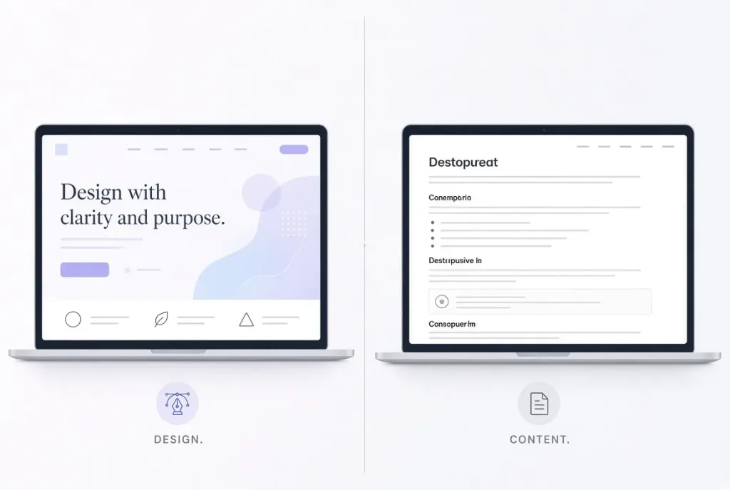
Website Design vs. Content: Every few months, this argument resurfaces in web design and marketing circles: does a website succeed because of how it looks, or because of what it says? Designers point to bounce rates. Content strategists point to organic traffic. Both sides have data. Both sides are right — just about different stages of the same visitor’s journey.
Here’s the short answer before we get into the evidence: design earns the first impression, content earns the outcome. They aren’t competing priorities — they’re sequential ones, and treating them as an either/or choice is why so many redesigns and content overhauls underdeliver.
The 50-Millisecond Problem
Design wins the opening argument, and the data isn’t close. Researchers at Carleton University found that people form an opinion about a web page’s visual appeal in as little as 50 milliseconds of exposure — faster than a single blink. Google’s own research team later ran a related study and reached a similar conclusion: a website’s first impression is shaped almost entirely by two factors, visual complexity and “prototypicality” (how closely a design matches what users already expect a site in that category to look like), and this judgment forms within roughly 17 to 50 milliseconds.
Practically, this means a visitor decides whether your site looks credible before they’ve read a single word of your content. If your design looks cluttered, dated, or unfamiliar, most people won’t stick around long enough to find out your content is actually excellent.
This is also where the trust research gets interesting. In a widely cited study on web credibility, 94% of respondents pointed to design-related elements — not content — as their reason for not trusting a particular website. Separately, research cited by Adobe found that 38% of people stop engaging with a site altogether if the layout or visual presentation is unattractive. Design, in other words, is the gatekeeper. It decides whether your content ever gets read at all.
But Nobody Actually Reads Your Design
Here’s the twist: once someone clears that first-impression hurdle, design stops being the main character. Decades of eye-tracking research from the Nielsen Norman Group has consistently found that the vast majority of web users scan pages rather than reading them word-by-word — in NN/g’s original study, 79% of test subjects scanned every new page they encountered, while only 16% read linearly. Follow-up research quantified just how little actually gets read: later studies confirmed that people typically absorb only a small fraction of the words on any given page, and NN/g’s F-pattern eye-tracking work found that users scan in an F-shaped pattern, concentrating attention on the top and left side of the page while largely ignoring text elsewhere.
What does that mean in practice? Beautiful typography and a polished layout won’t save poorly structured content — but well-structured content (clear headings, front-loaded key points, scannable formatting) can succeed even in a fairly plain design, because it’s built around how people actually behave, not how designers wish they behaved.
This is the piece both camps tend to miss: design determines whether content gets a chance. Content structure determines whether that chance turns into an outcome — a sale, a signup, a return visit, a share.
What Google Actually Rewards: Content, With Design as a Supporting Signal
If your traffic goal is organic search rather than direct visits, the content-vs-design math shifts even further toward content — but not entirely.
Google has been explicit about this in its own documentation. Its Search Central guidance states that automated ranking systems are designed to prioritize helpful, reliable information created to benefit people, not content built to manipulate rankings, and recommends creators evaluate their pages through a “Who, How, and Why” lens tied to E-E-A-T (Experience, Expertise, Authoritativeness, Trustworthiness). Since March 2024, this “helpful content” evaluation was folded directly into Google’s core ranking system rather than running as a separate, periodic update — meaning content quality is now assessed continuously, not just during occasional algorithm refreshes.
Design still matters here, but as a supporting ranking signal rather than the main one — through Core Web Vitals (load speed, visual stability, interactivity), mobile-friendliness, and accessibility. A brilliant article trapped in a slow, broken, or hard-to-navigate layout will still underperform, because a bad UX experience is itself something Google’s systems and human quality raters are trained to notice. But no amount of design polish substitutes for a page that doesn’t actually answer the query.
So Which One Should You Prioritize?
Rather than picking a side, it’s more useful to map each discipline to the job it’s actually good at:
- Design’s job: earn the first 50 milliseconds, establish trust and legitimacy, and structure the page so scanning behavior naturally leads to the content that matters (this is where UI/UX design and content strategy actually merge — good information hierarchy is a design decision that serves content).
- Content’s job: satisfy the reason the visitor came in the first place, hold attention once the design has bought you a few seconds, and give search engines a genuine reason to rank the page beyond keyword matching.
A useful gut check: if your site currently gets more social shares and return visits than search traffic, your design is likely outperforming your content. If the opposite is true — decent rankings but people bounce fast — your content is doing the SEO work, but your design isn’t converting the click into an experience worth staying for.
The Bottom Line
Design vs. content isn’t really a debate — it’s a relay race. Design’s leg comes first, deciding in under a second whether anyone will stick around. Content’s leg comes second, deciding whether that visitor becomes a reader, a customer, or a bounce statistic. Sites that treat this as a binary choice tend to either look great and rank nowhere, or rank well and convert nobody. The sites that actually grow traffic sustainably are the ones that stopped asking “design or content?” and started asking “how do these hand off to each other cleanly on every page?”
Please log in to leave a comment.